
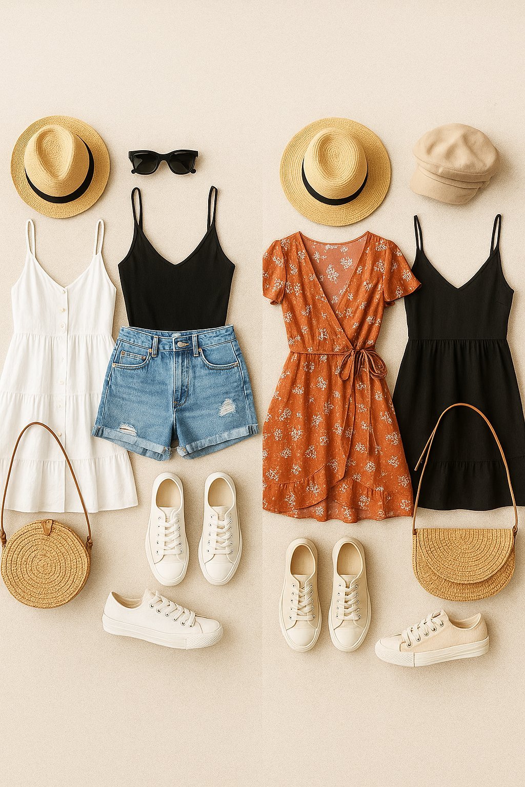
Summer dressing should be the easiest thing in the world — it’s hot, you want to be comfortable, and yet somehow matching colors feels harder when half your wardrobe is involved. The paradox: fewer clothes should mean simpler choices, but without the structure of jackets and layers, color mistakes show more. If you’re wondering what colors go well together for a casual summer outfit, this guide gives you the straight, no-fluff answer.
Good news: summer color matching runs on a few dead-simple rules, and there are about ten combinations that basically never fail. Learn the rules once, and you’ll get dressed in 30 seconds all summer.
The Foolproof Summer Combinations
Let’s start with the combinations that work every single time. White + anything is summer’s cheat code — white tee or linen shirt with any color bottom looks fresh and intentional. Navy + white + tan is the classic coastal combo that flatters everyone. Olive + white + brown feels earthy and relaxed. And black + white never fails, though in high summer it can feel heavy — break it up with sandals and minimal accessories.
For a little more personality: coral + navy, mustard + denim, sage green + cream, and terracotta + white are all warm-weather winners. The pattern: one warm or saturated color anchored by neutrals (white, navy, denim, tan). You almost can’t go wrong when brights are balanced with neutrals. Pantone color resources and trend palettes
- White + anything: summer’s universal cheat code — fresh with every color.
- Navy + white + tan: the classic coastal trio; flatters every skin tone.
- Olive + white: earthy, relaxed, effortlessly put-together.
- Coral or terracotta + navy/white: warm color anchored by neutrals.
- Sage + cream: soft, modern, and easy for hot days.
The Simple Rules Behind Good Color Matching
Rule one: pair one statement color with neutrals. Two loud colors fight each other; one loud color with white, navy, denim, khaki, or gray looks deliberate. Rule two: match undertones — warm colors (coral, mustard, terracotta, olive) play well together, and cool colors (navy, teal, lavender, mint) play well together. Mixing warm and cool can work but it’s advanced mode.
Rule three is about value (light vs. dark): high contrast (white top, dark bottom) looks crisp and energetic; low contrast (cream top, tan shorts) looks soft and relaxed. Neither is wrong — they’re moods. And the 60-30-10 guideline helps: 60% dominant color, 30% secondary, 10% accent. It keeps outfits balanced without thinking. ColourLovers community color palettes
- One statement + neutrals: let one color shine; neutrals support it.
- Match undertones: warms with warms, cools with cools — mixing is advanced.
- Use contrast intentionally: high contrast = crisp; low contrast = relaxed.
- 60-30-10 rule: dominant, secondary, accent — automatic balance.
- When in doubt, add white: white rescues almost any questionable combination.
Summer-Specific Color Tips
Summer light is harsh and bright, which washes out very pale colors and intensifies brights — keep this in mind. Pastels look beautiful in summer but can disappear on camera and in bright sun; anchor them with a slightly deeper neutral. Linen and cotton in natural textures make even simple color combos look richer — fabric texture does half the work in summer outfits.
Also consider your skin: sun-kissed skin handles brighter colors beautifully, which is why summer is the time to wear the coral or turquoise you’ve been avoiding. And don’t forget the power of a tan leather sandal or woven bag — warm accessories tie summer color stories together better than any matching trick. When all else fails: white top, denim bottom, tan sandals. Done.
- Bright light intensifies color: brights pop more in summer sun — embrace it.
- Anchor pastels: pair pale colors with a deeper neutral so they don’t wash out.
- Texture counts: linen and cotton make simple combos look intentional.
- Tan accessories unify: leather sandals and woven bags tie summer outfits together.
- The emergency uniform: white top + denim + tan sandals never fails.
Common Mistakes to Avoid
Before you put any of this into practice, save yourself the learning curve: here are the classic errors that derail progress. I’ve made several of these myself, so consider this the shortcut I wish I’d had.
- Two loud colors fighting: one statement color + neutrals always works; two brights compete. Let one color be the star.
- Ignoring undertones: warm coral with cool mint clashes subtly. Warms with warms, cools with cools — mixing is advanced mode.
- All-pale outfits washing out: head-to-toe pastels disappear in bright sun. Anchor pale colors with a deeper neutral.
- Forgetting the 60-30-10 balance: equal thirds of three colors looks chaotic. Dominant, secondary, accent — in that proportion.
- Matching too perfectly: head-to-toe exact-match looks costume-y. Coordinated (not identical) colors look effortless.
Frequently Asked Questions
Can I wear black in summer?
Yes — but keep it breathable (linen, light cotton) and break it up: black top with white bottoms, or black dress with tan sandals. All-black in high summer heat is a warmth and mood choice; it’ll be hot but it still looks sharp.
What colors look good on tan skin?
Sun-kissed skin handles brights beautifully — coral, turquoise, white, and jewel tones all pop. This is the season to wear the saturated colors you’ve been avoiding. White against a tan is the classic for a reason.
How do I wear neon without looking ridiculous?
One neon piece + neutrals. Neon top with white jeans and tan sandals; neon shoes with an otherwise neutral outfit. Neon as the accent (10% of the outfit) is striking; neon as the base is a safety vest.
Do I need to match my bag to my shoes in summer?
No — modern style doesn’t require it. Coordinate within the same universe (tan sandals + woven straw bag = perfect) rather than exact matching. The matchy-matchy rule retired years ago.
Pro tip: Tell one person what you’re working on. Social accountability — even casual — measurably increases follow-through. You don’t need an accountability partner; you need a witness.
What colors go well together for a casual summer outfit: The Bottom Line
Summer color matching is simple: anchor one statement color with neutrals (white is the universal cheat code), match warm undertones with warm and cool with cool, and use the 60-30-10 balance. The ten combos above — white+anything, navy+white+tan, olive+white, coral+navy — will carry you through the whole season. And the emergency uniform (white top, denim, tan sandals) exists for the mornings your brain won’t cooperate. Getting dressed should take 30 seconds, not 30 minutes.