Small rooms have a way of feeling smaller than they are — especially when the paint color fights against them. But color is genuinely powerful here: the right shade can make a 10×10 bedroom feel open and airy, while the wrong one makes it feel like a closet. I’ve painted my share of tiny rooms, and the principles are consistent. Here’s what is the best paint color to make a small room feel larger, and just as importantly, how to apply it.
The Core Principle: Light and Continuous
Two things make rooms feel bigger: light reflectance (light colors bounce more light around) and visual continuity (fewer color breaks = fewer visual “stops” for the eye). Every recommendation below serves one of these. Dark colors absorb light and advance toward you visually; light colors recede. It’s simple physics applied to perception.
The Best Colors for Small Rooms
- Warm whites (not stark blue-white): The safest, most effective choice. Warm whites like Benjamin Moore’s White Dove or Sherwin-Williams’ Alabaster reflect tons of light without feeling clinical. They work with any decor and make the room feel clean and open.
- Pale warm grays / greige: The modern neutral. Light greige adds subtle sophistication while staying bright. Avoid dark charcoal in small rooms — it’s dramatic but shrinking.
- Soft sage green: Light, natural, calming — and it connects visually with outdoor greenery through windows, extending the perceived space outward.
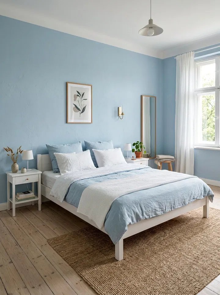
- Pale blue / powder blue: Blues recede visually, which literally makes walls feel farther away. Great for bedrooms — calming and spacious.
- Blush / pale peach: Warm, flattering light reflection, surprisingly spacious-feeling. Works beautifully in low-light rooms.
- Light buttery yellow: In north-facing or windowless small rooms, pale warm yellow fakes sunshine convincingly.
The common thread: light, slightly warm, muted rather than saturated. Bold saturated colors — even light ones like bright turquoise — create visual energy that makes walls feel closer.
Application Tricks That Multiply the Effect
Color choice is half the battle; application is the other half:
- Paint the ceiling the same color (or bright white) — a white ceiling against colored walls creates a visual “lid” that lowers the perceived ceiling. Same-color walls and ceiling blur the boundary and lift it.
- Paint trim the same color as walls (in satin sheen for contrast) — contrasting white trim chops the room into sections; monochromatic trim lets the eye flow uninterrupted.
- Use one color throughout connected small spaces — hallway, bedroom, bath in the same light tone reads as one larger area.
- Satin or eggshell sheen reflects more light than flat — a subtle but real brightness boost.
- Extend color onto the ceiling in very small rooms (powder rooms, nooks) — it erases boundaries entirely.
For the full technique rundown, see our guide to painting mistakes to avoid.
What About Dark Colors in Small Rooms? (The Honest Nuance)
Design magazines love moody dark small rooms — powder rooms, libraries, dens. And they’re right that dark colors can look stunning. But there’s a distinction: dark colors make small rooms feel cozy and intentional, not larger. If your goal is spaciousness, light wins. If your goal is drama and you embrace the coziness, a deep navy or charcoal powder room is gorgeous. Just know which effect you’re choosing. For bedrooms and living spaces where spaciousness matters, stay light.
Test Before You Commit
Small rooms are unforgiving of color mistakes — there’s nowhere for a wrong color to hide. Always:
- Paint large test swatches (2×2 feet minimum) on at least two walls
- Observe for 48 hours in all lighting conditions
- Compare 2–3 finalists side by side — the differences that look subtle on a chip become obvious on a wall
Our bedroom repaint cost guide includes sampling in the budget — $15 in samples prevents a $300 mistake.
Beyond Paint: Supporting Tricks
Paint works best combined with: decluttering (visual calm = spaciousness), mirrors opposite windows, furniture with visible legs (floor visibility = space), and good lighting. Our guide to small bathrooms applies these same principles room by room.
Testing Colors in Small Spaces (The Method That Works)
Small rooms punish color mistakes more than large ones — there’s nowhere for a wrong color to hide, and you’ll see every wall constantly. The testing method that actually works: paint large swatches on foam boards (not directly on the wall), and move them around the room for 48 hours. Foam boards let you test against different walls, in different light, without committing.
Test in the room’s real conditions: view the boards in morning light, afternoon light, and with your actual lamps on at night. Colors shift dramatically — a greige that looks perfect at noon can go muddy purple under warm LEDs at 9 p.m. Compare finalists side by side, never from memory. And test the ceiling color too if you’re painting it — ceiling paint looks darker than the same color on walls because of the angle of light.
Most paint stores sell sample quarts for $5–$8, and Sherwin-Williams’ color tools (and similar from other brands) let you visualize digitally first. But digital never replaces the foam board — screens lie about color in ways paint doesn’t.
Common Small-Room Color Mistakes
A few traps to avoid: painting one accent wall dark “for interest” — in a small room, it usually just makes that wall advance and the room feel lopsided. If you want drama, commit to the whole room (the cozy-den approach) rather than half-measures. Choosing color from a tiny chip — colors intensify at scale; the soft sage on the chip becomes full green on four walls. Always test large.
Ignoring the undertones: every “neutral” has one — pink, yellow, green, blue. Compare your finalists against a pure white board in daylight; the undertone jumps out. Forgetting the fifth wall: a dingy ceiling ruins the effect of perfect wall color — paint it fresh white or the wall color. And glossy finishes on imperfect walls — higher sheen shows every flaw; in small rooms with older drywall, eggshell is the safer brightness play over satin.
The Bottom Line
The best paint color to make a small room feel larger is a light, warm, muted tone — warm white, pale greige, soft sage, or powder blue — applied with matching ceiling and trim for maximum continuity. It’s a $150–$300 DIY project that changes how the room feels every time you walk in. Test first, commit confidently, and enjoy your suddenly-bigger room.